What’s My Color?

One often faces a situation where multiple choices seem equally good, but only one option can be chosen. Which sunglasses to buy? Will I get my Lambo in orange or yellow? Which shirt to wear for the wedding starting in twenty minutes?
In the world of pocket squares this question is inevitable. Loads of patterns, fabrics and color schemes are available for those who won’t settle for the solid color ones. There are multiple websites & blogs covering the topic of selecting the best square for the look, such as The Art of Manliness, GQ and Mr. Porter. As with any other area of clothing, trends tend to shift and cycle as time passes. Often the sound advice is to go bold with the patterns and simple on the folds. Large patterns and flashy colors brighten up any combination and work as a conversation opener as well. Others recommend that one should not try too much to match the square to the color of tie or shirt but compliment the combination. These are some good ground rules to start with.
Personally I think that trusting your own taste often works best. Not that I don’t follow similar ground rules as the sites suggest once in a while. Most of the times I just go with the gut feeling and choose a color that suits the jacket and complements the shirt/tie combo. I try to avoid too similar colors though (gray on gray) unless it’s for a theme or some other specific reason. Contrast in general is good, both in patterns of the square and in the color scheme of the complete outfit, unless of course, you want to blend in the mass as an FBI agent. Follow the guidelines or make your own – as long as you always remember to carry your FatCloth.
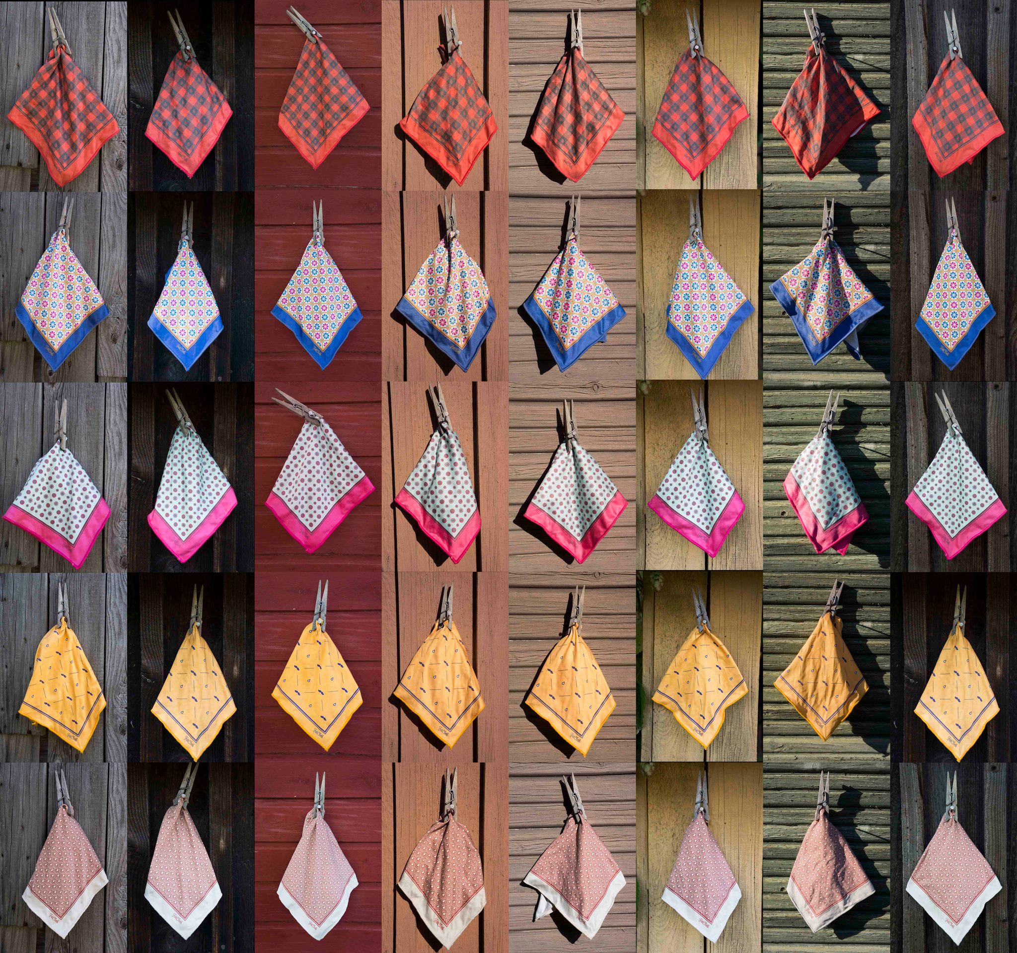
Recently I visited our summer cottage and tried out a few selected patterns against some rough wooden surfaces to see what would match which broken hue. Broken because I avoid strong colors in my suits and prefer grayish or “natural” base tones complemented by the personality of the fabric. These are easy to brighten up with any color (tie or pocket square). To my surprise, all the combos worked well enough. The biggest issue was retouching the images to fit different lighting scenarios while trying to maintain the true color of the squares. I’m not a professional photographer as you might have already guessed.
What do you think - do they match? Does some suck more than others? Discuss the topic or any other on our Facebook wall!
Autumn’s greetings!
e

