The Art of Matching Pocket Square Colors with Your Outfit
The pocket square. That small yet mighty accessory that can transform your outfit from uneventful to something that will be noted, appreciated and remembered. A carefully selected pocket square is the cherry on top of your sartorial sundae—if done right, a visual business card of your persona. A word of warning – you can stray from the path of awesomeness by choosing the wrong combination too. Alas, don’t worry, Vincent is here to guide you through the maze of colors, patterns, and combinations for those combinations that will help you on your way to becoming a style god envied by others and followed by many.
#1 the golden rule
Complement, don't Match
Even if someone occasionally manages to pull one off with some class, one of the biggest mistakes in pocket square pairing is the urge to match it perfectly with your tie. Resist the temptation. A pocket square should complement your outfit, not mimic it. Think of it as a supporting actor, not the lead. If your tie is bold and patterned, go for a more subdued pocket square. If your tie is solid, a patterned or textured pocket square can add just the right amount of flair.
Getting a set of affordable plain colored matching silk tie & square at the mall sounds straightforward but don’t fall for it – it’s the devil’s plot. If you wear them, don’t wear them together for god’s sake! Unless, of course, you’re at a theme party.
#2 the practise
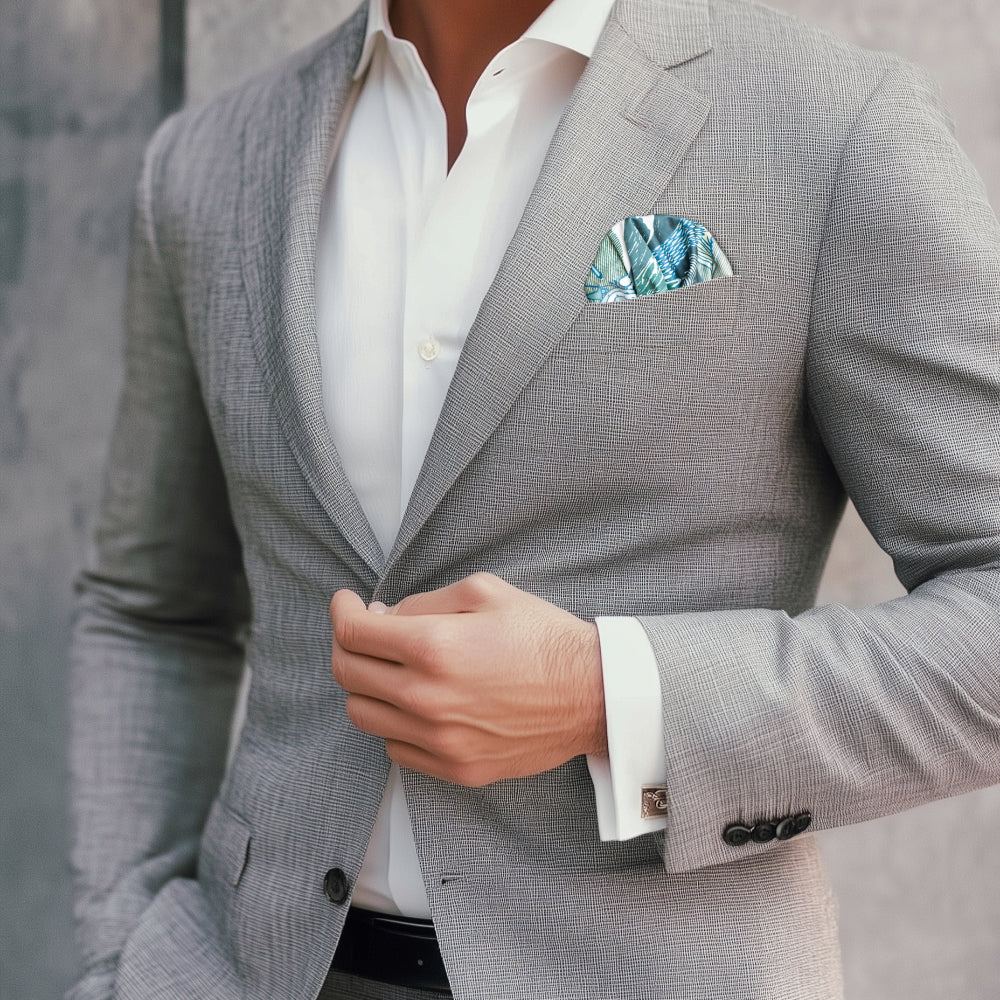
Pocket Square Color Coordination
When it comes to color, a little theory goes a long way. Use the color wheel as your cheat sheet. Complementary colors (those opposite each other on the wheel) can create a striking balance. For example:
- Navy Suit: Pair it with a burnt orange or golden yellow pocket square for contrast. Orange works surprisingly well with denims too. Try the FatCloth Butrus Orange with a Levi’s jacket and you’ll know what we mean.
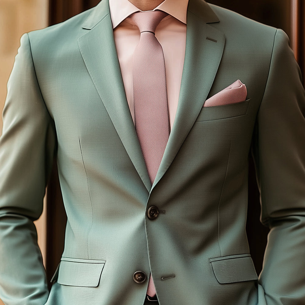
- Grey Suit: True, grey is not on a color wheel, but try a soft pink or a pastel blue pocket square to add a touch of warmth. Maybe this FatCloth Moomin Carousel?
- Burgundy Suit: Try forest or sage green base with a nice pattern – it will stand out but won’t make you look like fruit basket.
- Sage Suit: And vice versa, having an earthy burgundy square like the FatCloth Marcus Maroon in the pocket of a green suit won’t make you a strawberry but will definitely catch the eye.
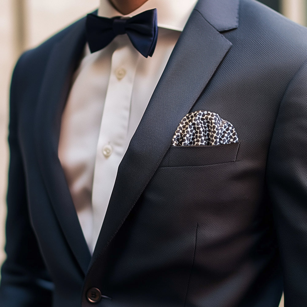
- Black Suit: Accurate, black is not a color at all and therefore not placed on the wheel either, but a white pocket square with a subtle pattern on a black background is a timeless choice with plenty of contrast. Just test FatCloth Aziz or Bernie White out for size. Don’t shy away from deep red or emerald green either for something unexpected.
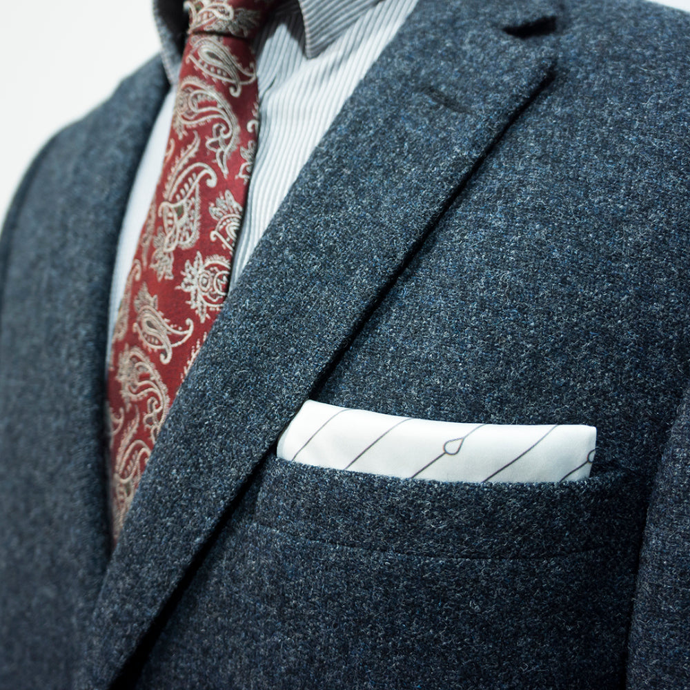
#3 the patterns
seasoning of style
Patterns can be a bit tricky, but they’re worth mastering. If your tie or shirt has a bold pattern, keep your pocket square relatively simple. On the flip side, if your outfit is all solids, a patterned pocket square can bring the entire look to life. Stripes, polka dots, paisleys—the world is your oyster. Just remember: less is more. You don’t want to look like you’re auditioning for a role as a magician. You can find a comprehensive selection of different patterns created for our FatCloth Originals Collection here.
#4 the structure
Textures Matter
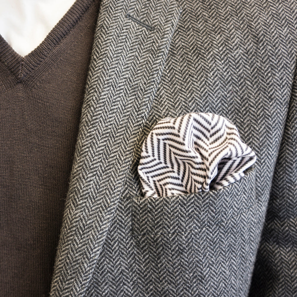
Don’t underestimate the power of texture. A silk pocket square exudes elegance, but a cotton or linen one can add a touch of casual cool. A multipurpose square like the original FatCloth is a modern combination of the above and can be used with many styles and outfits. As a general rule the texture should align with the formality of your outfit and the occasion. Think of it like this: silk for weddings, linen for garden parties, and cotton for the office and you’ll get the drill.
#5 the seasonality
fit your square to the climate
Seasons can also influence your pocket square choices. After all, few of us wear shorts in the middle of winter. In summer, lighter fabrics and brighter colors reign supreme. In winter, opt for richer tones and heavier fabrics like wool. It’s all about matching your accessory to the vibe of the season. You can also play around with seasonal themed designs, such as snowflakes, autumn leaves or for example themed artworks like the FatCloth x Mucha Winter
#6 the artwork
Themed Pocket Square Designs Add a Playful Touch
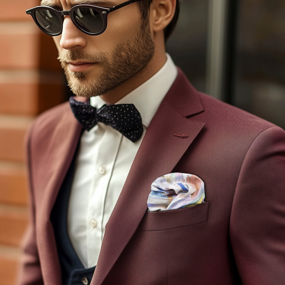
For those who love a bit of fun and creativity, themed pocket squares can be a conversation starter. Imagine a pocket square inspired by famous paintings, like Van Gogh’s "Starry Night" or Alphonse Mucha’s iconic Art Nouveau posters. Or perhaps one featuring beloved cartoon characters, like the Moomins for example —perfect for adding a hint of whimsy to a casual outfit. One can easily find a suitable gift to a fellow connoisseur from carefully selected themed designs.
Movie buffs might enjoy designs inspired by classic films, while nature lovers could opt for floral patterns reminiscent of Monet’s garden. These themed designs work best for relaxed occasions where you can let your personality shine. Just make sure the rest of your outfit stays understated to let the pocket square take center stage.
#7 the fold
how to present your square
Last but not least, how you fold your pocket square matters. While there are plenty of fancy folds out there, you really can’t go wrong with the Bernie White classic flat fold or a casually elegant puff. Overcomplicating the fold can make you look like you’re trying too hard—and we both know you’re effortlessly stylish. Patterns work differently with different folding styles, so play around with the folds for a while and you can create unexpected outcomes.
#8 the mistakes
Combinations to Avoid
While pocket square selection offers plenty of room for creativity, there are some combinations better left untouched. Vincent wanted to share a few examples that will help you get a hang of the general idea what to avoid:
- Navy blue pocket square with a navy suit: This combination blends in completely and fails to provide any contrast or interest. If you’re wearing a navy suit, go for a pocket square that stands out clearly—like orange or light gray. Same goes, of course, with black on black etc. Always remember, different color, ample contrast or both.
- Perfect color match with your tie: Vincent wanted to repeat the golden rule again just to make it clear that choosing a stylish square isn’t a task fit for an an 80s wedding photo. Identical colors for both the tie and pocket square make the ensemble look flat and less stylish. Change either the shade or at least the pattern of the other.
- Too many patterns at once: A paisley tie, a striped shirt, and a polka-dotted pocket square? Too much is too much. If your outfit is already a festival of patterns, balance it with a solid-colored pocket square.
- Metallic pocket squares for everyday use: A silver or gold pocket square might be a fun addition to a party outfit, but in everyday settings, they often come across as tacky. A more subtle sheen, like satin silk, is usually a better choice. You can have a metallic effect that looks way better in everyday situations with a great gradient design, like the one on FatCloth Esko for example.
- Pocket square that’s too large or too small for the pocket: A pocket square bulging out of your pocket like a crumpled tissue or disappearing entirely ruins the polished look. Ensure your pocket square fits the pocket perfectly. You can use tools like the FatCloth Pocket Square Holder to help fix the fold in place as well.
Avoid these pitfalls, and you’ll be one step closer to pocket square perfection. Remember: less is often more, and clarity beats clutter every time.
The conclusion
Final Thoughts on Matching the Pocket Square
Matching a pocket square to your outfit is less about strict rules and more about balance, creativity, and a dash of confidence. Experiment, but don’t overthink it. At the end of the day, a well-chosen pocket square is a reflection of your personality and a visual business card for the people you meet. So go ahead, show the world your sartorial prowess—and maybe even turn a few heads while you’re at it.
Now go forth and pocket square responsibly. You’ve got this. Vincent’s got your back.